Showing posts with label layouts. Show all posts

Monday, March 23, 2009

More scrapping...

Here is another layout I've done in the past 3-4 months.


« CREDITS »
Papers: Stacey Sansom's "Berry Delights"
Brads: Stacey Sansom's "Berry Delights"
Ribbon: Stacey Sansom's "Berry Delights"
Journal block: Stacey Sansom's "Berry Delights"
Fonts used: Petra Script EF, Artistamp


Monday, February 16, 2009

I've been scrapbooking!

I've been busy scrapping....Here are a couple I've been working on.

January 2008 – Andrew's first orchestra concert (2 pg spread)


« CREDITS »
Papers: Stacey Sansom's "Array of Color – Blues"
Bow & Ribbon: Stacey Sansom's "Berry Delights"
Fonts used: Lemon Chicken, Bickham Script Pro


February 2008 – Andrew's Arrow of Light ceremony (2 pg spread)


« CREDITS »
Papers: Stacey Sansom's "Array of Color", "Sunflowers and Daisies – Solids", and "Daisies"
Curly Brackets: Stacey Sansom's "Berry Delights"
Fonts used: New Times Roman, Vrinda


These are not the only layouts I have finished, but they are the ones I've got compressed for web display. I'll put up some more later.

Wednesday, November 12, 2008

Round 2, Part 1

Well we are into Round 2 of the Digital Scrapbook Place Designer Finder Contest.

This round had an additional challenge in it.
We had 2 parts:
1. Create a scrapbook layout using the kit we created in Round 1
2. Create 4 papers based on an assigned color scheme (5) colors and nothing more.

Here is my Round 2 Part 1 submission:


You can see all of the submissions to the contest by going to the gallery at Digital Scrapbook Place.

Saturday, July 05, 2008

Even more {Summer Fun} Layouts

This is my nephew. This was not an easy scrap...not because there is anything wrong...simply because I did not consider that I'd want the 3 layouts to match (use the same kit) when I started. The kit is purely pinks, orange, and green! Good thing there was orange and green to use.


Credits: "Victoria" by Stacey sansom
Fonts used: Adobe Caslon Pro, Bickham Script Pro, Century Old Style Std, and Arial Black

I am loving this kit. While it isn't going to be a go to kit 100% of with my boys, it does offer nice, softer options.

Friday, July 04, 2008

More {Summer Fun} Layouts

It has taken me a bit more time to complete these as I've been busy again. Wait, when am I not busy? I still have one more layout to do from this series of photos, one of my nephew.

These are my nieces:


Credits: "Victoria" by Stacey Sansom
Font used: Caflisch Script Pro


Credits: "Victoria" by Stacey Sansom
Fonts used: Adobe Caslon Pro, Virgin

I've really been enjoying scrapping the past few weeks. I can understand why people say it is therapeutic. I am not sure what kit I'll use for Darin's layout as I wanted to have them sort of match. I suppose it would be safe to use the greens and oranges from "Victoria." I don't know, yet.

Friday, June 20, 2008

First of the summer layouts

For those that are following the blog updates: The blog redesign is coming together nicely. I am making slow but steady progress. Products have been added to their own "Products" page and "Add to cart" buttons have been added to them. I will add more as time allows or as I create more products.

My goal this summer is to just scrapbook more than I have been. I've been stuck in the designing mode and everything has been...design...design...design...Even then I haven't been as productive in that area either though I have created new products over the past few months. This summer, however, I am going to scrap...for me...for the kids...That being said, I have done exactly that the past couple of days.

Here are the first of the summer layouts...


CREDITS: Stacey Sansom's "Sand and Water"
FONTS: Caflisch Script Pro

Sunday, May 18, 2008

I've been scrapping with "Summer Delights"


Lance was out playing in the sandbox. This is actually normal for him. This day, however, he caught my eye. Normally, he is content to get as dirty as possible. We had some rain the night before and I don't usually prevent him from his outside time regardless of the rain. He'll wash after all. I had gone out to check on him and saw him not sitting...rolling...laying...in the sandbox, simply...squatting...I stood there smiling...listening...I couldn't resist, I stepped back in the house and grabbed the camera. The words were precious, "Hey, don't put your sand on me" as he threw sand on the toy dinosaur and quickly covered him up. He unburied him again, and repeated. "Look mommy, I found a dinosaur!" His excitement was infectious.

Fonts used: Artistamp Medium and Bradley Hand

Kit used: "Summer Delights" by Stacey Sansom

Friday, January 04, 2008

Finished product


I couldn't just leave you all hanging on the whole CD Case calendar. I've had some interest on how to make them and I wanted to be sure to post a finished product so you could see just how useful they are. I LOVE them!

I am seriously considering making templates for them. I am not sure how fast I'll get to that, but I am seriously considering it.

Thursday, December 06, 2007

I think I am making progress

I couldn't take it anymore. I finally just went and sat down at the PC simply to use Photoshop and Illustrator. Let me tell you I was suffering from serious withdraw! I was up until 2:45AM this morning as a result. BUT in all fairness. . . I did get something done while working way into the wee hours of the morning. Yay! I even got my MacBook Pro backed up to the backup drive (I think), so hopefully soon I will have Windows installed on there and can have Photoshop back again (at least until I can afford the CS3 suite).

I'll add the rest as I get them done today. I am working diligently!!! I hope to have them all done today.


Fonts used: Artistamp Medium, Berylium, and Bickham Script Pro

Sunday, September 23, 2007

I had to do it!

They kept bugging me for an "about me" layout for the site at Dragonflaire Studios. I don't have many pictures of myself, so that was the first part of the challenge right there. I don't like the pictures I do have. That is another issue all together. It isn't so bad now that I have lost 20# but I am not glad to post pictures everywhere. I guess it just means that I'll have to update the page once I get newer pictures. The last part was "what do I do?" I didn't know! I started over at least 10 times.

This picture was taken in April by my son, Andrew. I like the picture simply because he took it! The papers in this layout are from my "Basic Shades" paper pack. The doodles are yet to be released. The font used is Bradley Hand.

Saturday, February 17, 2007

If duty calls, just scrap it

Well you all might be surprised to see something like this appearing - it hasn't happened in so long after all. I have officially SCRAPPED A PAGE! Now, it isn't a page of pictures - at least, not my pictures. It isn't even a page of my memories. It is a scrapped page, none the less. Go me! Scrap! Scrap! Scrap! It was such a release today. I should do this more often. I just don't always have the time. I should make the time. I guess I could spend less time trying to design, but I enjoy doing that too. I am just slow at all of it in general these days. But, I scrapped! Check it out. . .


What is this for? Part of my duties at church is to do the newsletters and calendars every month for the ladies group (the Relief Society) and to design flyers for the activities if needed. We have an activity coming up the first part of March. So here is the flyer! It is done completely with the kit that I am currently working on. It is a kit that is still un-named. I'll get there. I just can't decide. Part of working on this flyer really helped me get some stuff done for the kit - it was lacking in elements. I am excited about this flyer. I am excited about the new kit as well. I hope to have it released by the end of this coming week. We'll see if we actually get it out then, but I am going to try.

Fonts used: Amienne, Artistamp Medium

Saturday, July 22, 2006

Sometimes you just have to scrap

I posted a few days ago about my getting some scrapping done. I am finally making it back to post my layouts here for everyone to see. Hey, sometimes it takes a little more time than anticipated.

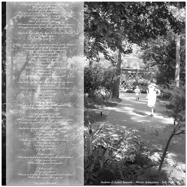
I call the first layout "Wonder" as it includes the lyrics to Lee Ann Womack's "I Hope You Dance." I thought it was just fitting for this picture. This is a picture of my oldest son chasing after my youngest son who was off to explore the arboretum without anyone else. He had a grand old time running around and checking everything out - especially the fish ponds. He was totally fascinated by the fish. I still need to scrap those pictures.

Credits:
Everything made by me.

Fonts used:
Bickham Script Pro
Adobe Garamond Pro

Programs used:
Adobe Photoshop CS2


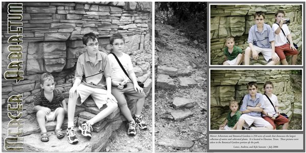
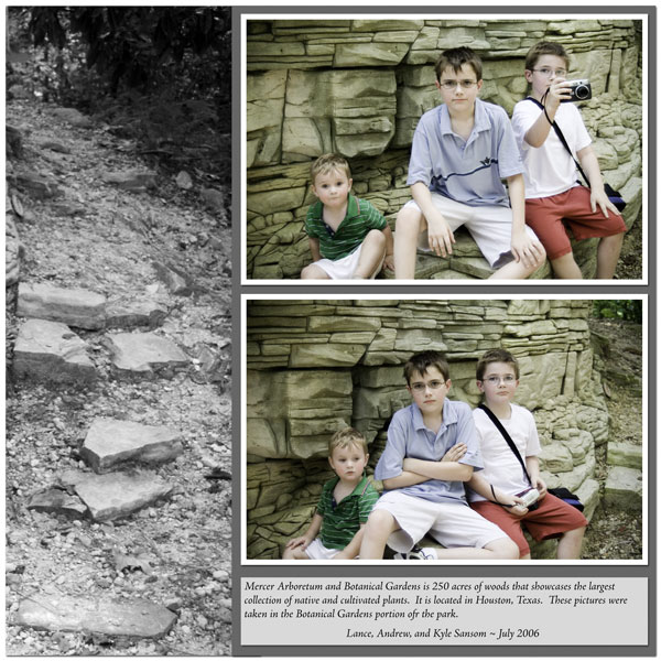
This next layout is a 2 page spread featuring all 3 of my boys on our trip to the arboretum. It was incredibly hot that day we went, but I think they all had a great time just seeing all there was to see. They had this lovely stone wall area that was perfect for resting (and for mommy to snap some pictures). I don't do many 2 page spreads, but this one was just fun.


Credits:
Everything made by me.

Fonts used:
Real Virtue
Adobe Jenson Pro

Programs used:
Adobe Photoshop CS2


And here are the 2 pages individually:

Saturday, July 01, 2006

Digital Scrapbooking should be my priority

Digital scrapbooking should be my priority, but the reality is that I have other things in my life that take over. I have been so busy that I can't even think about digital scrapbooking most days. When I do have time I am so stinking tired that I just can't bring myself to scrap.

Alas, I have scrapped 1 page in the past couple of months. This is since the Ultimate Digital Scrapper contest. I didn't make it past round 1, but it did break me out of my shell. Anyway, here is the latest page I have done.

Credits:
Everything is made by me.
Fonts used: Helterskelter (not sure where I got it from) and Artistamp (www.haroldsfont.com)
Program used: Adobe Photoshop CS2

I am not sure what caused the sudden "need to scrap." It might have something to do with the fact that I have a new digital camera to play with and while it isn't a perfect transition from my old digital camera along with the really crappy pictures I am also getting some really great pictures as well.

I am sort of disappointed that I haven't had more time. There is so much that I want to do. I was supposed to start selling in the store at ScrappyKats but it seems that the owner has gone A-WOL. It is unfortunate. I am sure that she just got busy with life, moving, and a new baby. Still. . . But the opportunity has come up that if I can pull it off in time Scrapbook Bytes has a call out for designers for their store. I WANT TO SO BAD! I hope that I can get everything together tonight or tomorrow and get it submitted. HOPEFULLY!!! It would be an amazing opportunity.

So off to compile the requirements for the SBB store stuff. . . .

Friday, May 05, 2006

Let the contest go on. . .

I overcame my fear and personal insecurities and entered a digital scrapbooking contest. The 2006 Ultimate Digi-Scrapper Contest over on digiscrappin.biz to be exact. Now I don't know if I have totally snuffed out the insecurities, but this was a good start. There are a lot of good entries. There are some big names in the digital scrapbooking world. It should be fun!

Here is a link to the contest's gallery: 2006 Ultimate Digi-Scrapper Contest Gallery -- Week One

And since there are 370+ registered entrants, here is a direct link to my contest entry: Stacey's first week entry.

Thanks for looking.

Thursday, January 12, 2006

what did these earlier works become?

Previous post: a comparison of earlier works

I started scrapbooking 5x7 layouts for a special project. It was a project of love. I wanted to provide my husband's grandmother with pictures of the kids that wouldn't be a burden on her to carry around the nursing home in her walker basket. I need something small, hence 5x7.

I decided that I was going to redo the three 8x10 layouts I showed in my previous post (see link at the top of this post). I just wasn't happy with them. I had learned a bit since the time I had created those layouts.

Here is what they became:


The same pictures. The same elements. The same fonts. Different layouts.

Fo what it is worth, smaller layouts offer a nice challenge. How do you get it all on there without looking crowded and over done? Sometimes I do better than others. It is a fun challenge though.

A comparison of earlier works


It is important to constantly learn and grow.

In my opinion, it is also important to NOT get emotionally attached when we are first learning how to do something. As we gain knowledge and skills, we need to take a look back and see what we have learned and take the steps necessary to become better at whatever we are doing. Sometimes it is important to look back on some of our earlier works and see how we can improve them. It is ok to look back and reflect. It is wonderful to bask in the joy of growth.

Here are some earlier pieces I worked on. They were 8x10 layouts. I selected this size because I COULD print it at home on my own printer with my own paper of choice. I won't even say that these were 100% completed before I moved on and "redesigned" them. I thought it would be interesting for others to see where we come from. Maybe it will give them more desire to improve, grow, and digiscrap more. *wink*

== Important credits ==
There are not a whole lot of credits to give. All of the elements used were made by me. The tags, the patterned paper, torn paper, vellum, the bards. . .

Fonts used on Andrew's layout: Palantino Linotype (in italic)
Fonts used in Kyle's layout: Comic Sans
Fonts used in Lance's layout: Palantino Linotype

== Programs used ==
» Macromedia Fireworks MX
» Adobe Photoshop Elements 2
» Adoble Photoshop 7

I think the thing that I learned most about doing these three layouts is to just have fun. No, I won't call them my best works of art. At the same time, I won't call them my worst.

In reality, I learned a lot while working on these three layouts. Each layout offered it's own challenges. I learned how to make patterned paper. I learned how to tear paper. There is a fine art to tearing paper digitally. It isn't an exact science either. I learned a lot of about dropping shadows and making things appear to be more realistic when compared to a true paper scrapbook page. I played with image correction and alteration (turning to sepia tones, editing things out, etc). I even stepped right into playing with color.

It is important to learn the programs that you are using. The more you know about your digital scrapbooking "environment," the more comfortable you will be. If you are comfortable, you will will be willing to try different things. If you are using one program and you have given it a real honest effort, don't be afraid to change to something else. Just think about how it will look on your resume. *wink*

A Christmas Layout

Christmas is always fun, but it often yields a lot of pictures around my house. I suppose I don't have to take as many pictures, but that takes the fun out of it doesn't it? I am not even sure how many pictures I took this year, but I have gotten really good at getting those candid shots of the kids opening presents. Granted, not all of them turn out. I only ask for a few out of many, that's all.

Here is a layout for Christmas 2004:


Everything was made by me. The patterned paper. The metal words.

Font used for the metal words: Gigi
Font used for the titles and other text: Footlight MT

Programs used: Adobe Photoshop 7

Credits: Stacey Sansom's "Summer Delights" | Fonts used: ...............